
Did you know that 90% of first impressions about visuals are based on color? This fact shows how big of a role color plays in visual storytelling, like in photography. As a photographer, knowing color theory is key to making images that grab the viewer’s attention and pull them into the story.
Color theory is based on the color wheel, a concept Sir Isaac Newton introduced in the 1660s. It helps me understand how colors work together. Whether it’s the bright primary colors or the complex secondary and tertiary colors, mastering color harmony makes my photos pop.
In the next parts, I’ll dive into the details of color theory in photography. We’ll look at different color mixes and how to use them to show mood and emotion. By using these techniques, I can make my photos not just eye-catching but also tell a powerful story.
Key Takeaways
- Color selection can profoundly impact viewer perceptions and emotional responses.
- Understanding the color wheel is essential for creating harmonious images.
- Complementary colors enhance contrast and vibrancy in photos.
- Warm and cool colors evoke specific feelings and can drastically alter the mood of an image.
- Intentional color choices significantly improve visual storytelling in photography.
The Basics of Color Theory
Color theory is key for photographers who want to tell better stories with their images. At its core is the color wheel, a tool that shows how colors relate to each other. It breaks colors into primary, secondary, and tertiary groups, giving a solid base for picking colors.
Understanding the Color Wheel
The color wheel shows the range of colors, starting with the three primary colors: red, yellow, and blue. Mixing these colors creates three secondary colors: green, orange, and violet. Then, mixing these secondary colors gives us six tertiary colors. This makes a total of twelve colors, all ready to be used in photography.
Primary, Secondary, and Tertiary Colors
Knowing how to use primary colors is the first step in creating complex color schemes. The secondary colors come from mixing the primary colors. And the tertiary colors are made by mixing a primary color with a secondary color next to it. This lets me play with different color combinations, making my photos more engaging.
The Role of Color Harmony in Photography
Color harmony is essential for making images look better. Using complementary colors like red and green, or yellow and purple, creates strong contrasts. Analogous color schemes, which are colors next to each other on the color wheel, bring a sense of unity. Understanding these concepts helps me use color to express emotions in my photos.
Color Theory in Photography
Color theory makes my photography better. I use complementary colors to create striking contrasts. For example, red and green or blue and orange make a bold visual impact.
On the other hand, analogous colors are next to each other on the color wheel. They create soothing and harmonious effects. Each color method has its own purpose in my images, setting the mood and conveying emotions.
Complementary and Analogous Colors
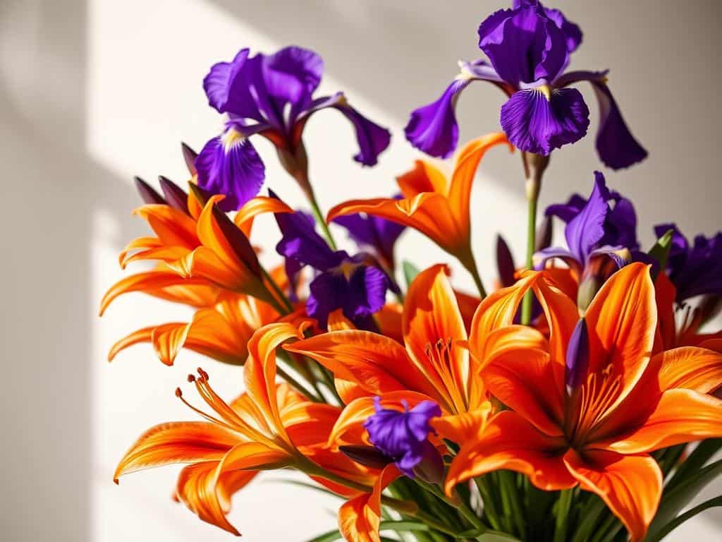
Complementary colors like yellow and purple or orange and blue add dynamic tension. This tension can evoke strong emotions, making it key for grabbing attention.
For a more subtle approach, I use analogous colors. These colors offer fluidity and unity, leading to a tranquil viewing experience. This way, I keep visual interest without overwhelming the audience.
Creating Vibrant Triadic Color Combinations
To add drama, I use vibrant triadic color combinations. I pick three colors evenly spaced on the color wheel. This creates lively and engaging visuals.
This method adds energy to my photos, perfect for lively scenes or subjects. The colors not only enhance the visual impact but also engage the viewers, drawing them into my captures.
Applying Color Theory for Mood Setting
Color theory is key for setting moods in my photos. Choosing the right colors affects how people feel. Different colors can change an image’s whole mood.
Choosing Color Palettes for Emotional Impact
When picking colors, I think about how they make people feel. Warm colors like reds and oranges bring energy. Cool colors, like blues, calm us down. Using these colors wisely helps shape the mood of my photos.
Utilizing Warm and Cool Colors
Warm and cool colors are powerful in my photos. Warm colors pull the eye towards the center. Cool colors make things seem farther away. This mix creates interesting and balanced images.
Balancing Colors through Composition
Color composition is essential for balance in my photos. The rule of thirds helps place colors right. It’s important to avoid too much color, as it can mess up the mood. But using the right colors makes my photos connect with viewers.
Conclusion
Learning color theory in photography is key to making my images stand out. It helps me understand how colors work together. This way, I can choose colors that make my photos pop and touch people’s hearts.
Exploring different color schemes like complementary, analogous, and triadic is important. It lets me create images that really connect with people. Each choice I make adds to the story I want to tell.
Using colors wisely is a big part of my storytelling. I can pick warm colors for excitement or cool colors for calm. With so many color options, I can adjust them to get the perfect mood.
In short, color theory helps me tell better stories with my photos. It lets me control how people feel when they see my work. This skill helps me turn simple moments into unforgettable images.
