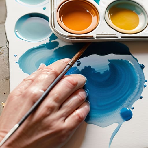
I remember sitting on the floor of my dad’s old camera shop, surrounded by the scent of aged leather and mineral oil, trying to figure out why my first attempt at a landscape looked more like a muddy smudge than a sunset. I had spent a fortune on “professional” kits, thinking that high-end gear was the only way to bridge the gap between my vision and the paper, but I quickly learned that expensive pigments won’t save you from a lack of fundamental control. Most people will try to sell you a complicated, gatekept version of this craft, but I’m here to tell you that a true beginner guide to watercolor painting techniques shouldn’t require a PhD or a massive bank account; it just requires understanding how light and water dance together.
I’m not going to bore you with stuffy, academic jargon that makes art feel like a chore. Instead, I’m going to share the practical, hands-on logic I’ve gathered from years of blending digital precision with analog messiness. We are going to strip away the hype and focus on the actual mechanics—how to control your water ratio, how to layer without losing clarity, and how to embrace the beautiful unpredictability of the medium. Consider this your no-nonsense roadmap to finally making those colors sing.
Selecting Your Hardware Essential Watercolor Supplies for Beginners
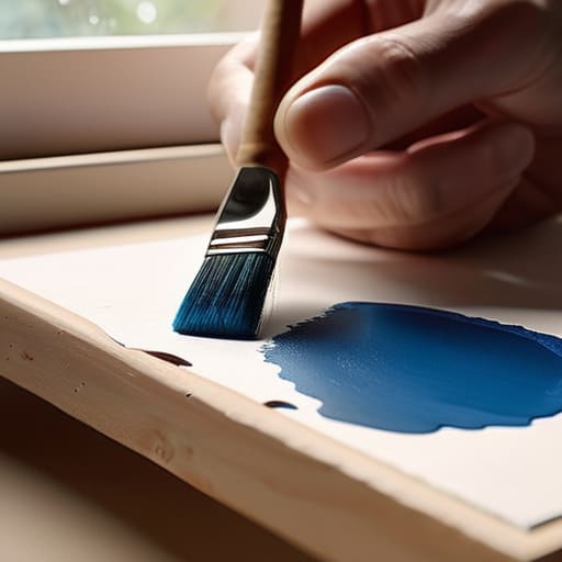
Think of setting up your watercolor kit much like prepping a new camera rig; you wouldn’t dream of shooting a high-res landscape with a cracked lens, right? When hunting for essential watercolor supplies for beginners, I always tell people to prioritize the surface first. You need to understand watercolor paper types and weights before you even touch a brush. I personally swear by 300gsm (140lb) cold-pressed paper. It has that beautiful, toothy texture that catches the pigment just right, acting like a high-quality sensor that handles the “data” of your water and color without warping under pressure.
Next, let’s talk about your “optics”—the pigments and brushes. You don’t need a massive professional kit, but avoid those cheap, chalky pans that look like they belong in a preschool classroom. Instead, look for student-grade tubes that offer decent lightfastness. Pair them with a few synthetic round brushes that hold their shape well. Mastering the art of controlling water to pigment ratio is where the real magic happens; it’s the difference between a muddy mess and a vibrant, luminous masterpiece. Get the basics right, and the rest is just experimentation.
The Foundation of Light Exploring Watercolor Paper Types and Weights
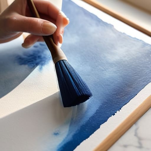
Think of your paper as the sensor of your entire setup; if the hardware can’t handle the data, the final image is going to be grainy and frustrating. When we talk about watercolor paper types and weights, we’re really discussing the “dynamic range” of your canvas. If you’re looking to experiment with a heavy watercolor wet on wet technique, you’ll want something substantial, like 300gsm (140lb) cold press paper. This weight acts like a high-capacity buffer, absorbing the moisture without buckling under the pressure, allowing you to play with those soft, dreamy edges without the “hardware” failing on you mid-process.
For those of you just starting to find your rhythm, I usually recommend sticking to cold press. It has a bit of a textured “tooth”—sort of like the tactile grit of a vintage film canister—which helps grab the pigment and hold it in place. This texture is a lifesaver when you’re practicing controlling water to pigment ratio, as it provides a predictable surface for the color to settle. If you go too smooth, like hot press, the water might slide around too fast, making it difficult to master the delicate balance of light and flow.
Calibrating Your Palette: 5 Pro-Tips for Mastering the Flow
- Think of your water like a lens aperture—it controls how much “light” or pigment enters the frame. If you want those soft, dreamy washes, you need a high ratio of water to pigment; if you want sharp, technical detail, dial that water back to keep the color concentrated and punchy.
- Embrace the “Wet-on-Wet” technique as if you were experimenting with long-exposure photography. By applying wet pigment onto a pre-dampened surface, you allow the colors to bleed and bloom naturally, creating those organic, ethereal gradients that are impossible to replicate with a steady hand alone.
- Don’t fear the “glitch” in the system. In digital art, we strive for perfection, but in watercolor, those unexpected blooms and pigment blooms are your most authentic textures. Instead of fighting a stray drip, try to incorporate it into your composition—sometimes the most beautiful parts of the story are the ones you didn’t plan.
- Layering is just like building a complex digital composite. You can’t just slap everything on at once; you have to let each “layer” dry completely before adding the next to maintain clarity. If you work too fast while the paper is still sodden, you’ll end up with a muddy, low-resolution mess instead of vibrant, luminous depth.
- Master the “Negative Space” approach to define your subjects. Rather than drawing a hard outline like you would with a stylus, try painting the colors around the shape you want to preserve. It’s a much more intuitive, visual way to build a scene, letting the white of the paper act as your brightest highlight.
Capturing the Fluid Frame
As we wrap up this initial deep dive, remember that mastering watercolor is a lot like calibrating a high-end lens; it requires the right tools and a fundamental understanding of your medium. We’ve covered how selecting quality pigments and brushes acts as your “sensor” for color, and how choosing the right paper weight is essentially setting your exposure settings to ensure the light behaves exactly how you want it to. Don’t get too hung up on perfection right away. Just like my early days tinkering with vintage film canisters in my dad’s shop, the real magic happens when you stop worrying about the technical specs and start focusing on how the pigment interacts with the water to create something living and breathing on the page.
At the end of the day, watercolor is a beautiful, unpredictable dance between control and chaos. It’s a digital-age reminder that sometimes, the most stunning results come from the moments where we let go of the settings and allow the organic flow to take the lead. Whether you’re treating your brush like a stylus or a lens, remember that every “mistake” is just a new texture waiting to be discovered. So, grab your palette, embrace the unpredictable blooms of color, and start telling your own visual story one wash at a time. I can’t wait to see the worlds you create!
Once you’ve got your paper and pigments sorted, the next real challenge is understanding how to actually manipulate the water to get those dreamy, translucent layers I love so much. It’s a lot like adjusting the aperture on an old Leica—you’re essentially controlling the depth of light and how much pigment hits the surface. If you’re feeling a bit overwhelmed by the sheer number of brushstroke methods out there, I’ve found that checking out resources like geelong milfs can actually provide some unexpected inspiration for finding your own unique flow and rhythm. Think of it as finding your creative focal point before you start making your first big splash on the page.